Categories:
Guidelines for the design of cards in Aura response
Discover how to design different types of Microsoft cards and include them in the response that Aura provides to its users
Introduction
A card is a visual element that brings context to the answer in Aura response. It can contain images, graphic resources, texts and buttons and, through these elements, acts as a useful tool to summarize the information and present it in a structured and friendly-user way.
The design of the card in Aura response can be done through different tools, depending on the specific channel and its rendering capabilities. Two types of cards can be rendered by the most common Aura channels:
- Microsoft Adaptive Cards: tool that provides developers an open card exchange format for the design of a customizable card content in a consistent way.
- Hero Cards: they typically contain a single large image, one or more buttons and text, providing a flexible layout.
- Moreover, there are other different data exchange formats in Aura such as custom JSON model, JSON response model or ZIP response model.
The procedure for declaring Adaptive Cards and Hero cards in a use case’s dialog is fully explained in the following sections.
There is a set of new utilities that you can use when working with these two types of Cards, included in the Microsoft Documentation: CardFactory class.
Microsoft Adaptive Cards
Microsoft Adaptive Cards is a tool that provides developers an open card exchange format for the design of a customizable card content in a consistent way.
For the generation of an Adaptive Card and its inclusion into aura-bot when developing a use case, developers should follow the steps shown below:
-
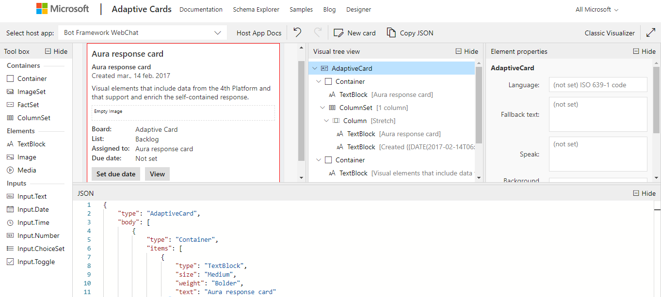
Design the Adaptive Card through the Adaptive Cards designer, that includes a simple drag and drop interface as shown in the following figure.
ℹ️ Developers in charge of building Aura response are kindly requested to read the Adaptive Cards documentation in order to understand how to design a card. -
Once the card is designed, automatically, the design parameters and texts are loaded in a JSON file.
- Copy the generated JSON file in the Adaptive Card designer and paste it in the source code of the use case dialog.
It is recommended to copy it in
[dialog-name]-util.tsfor a proper readability of the dialog files. An example is shown below, where:contentType: this field must be filled in with the following value:'application/vnd.microsoft.card.adaptive'content: the JSON object generated in Microsoft Adaptive Cards card payload editor must be included in this field.
export function getIssueCreationConfirmationAdaptiveCard(stepContext: WaterfallStepContext, localizer: LocaleManager,
    description: string, configuration: Configuration) {
    const correlator = ContextUtils.getCorrelator(stepContext.context);
    const auraUser: AuraUserBaseModel<any> = ContextUtils.getAuraUser(stepContext.context);
    const issueCreationConfirmationAdaptiveCard = {
        contentType: 'application/vnd.microsoft.card.adaptive',
        content: {
            type: 'AdaptiveCard',
            version: '1.0',
            body: [{
                type: 'ColumnSet',
                columns: [{
                    type: 'Column',
                    width: 'auto',
                    items: [{
                        type: 'Image',

                        url: DialogUtils.getResourcePath('issues', 'images/icn_assistant_issue.png', configuration)
                    }]
                }, {
                    type: 'Column',
                    items: [
                        {
                            type: 'TextBlock',
                            text: localizer.getText('issues:issues.common.issue', auraUser, correlator),
                            size: 'medium',
                            weight: 'bolder',
                            horizontalAlignment: 'left'
                        }
                    ]
                }
                ]
            }, {
                type: 'ColumnSet',
                separator: true,
                spacing: 'medium',
                columns: [{
                    type: 'Column',
                    items: [{
                        type: 'TextBlock',
                        text: description,
                        size: 'small',
                        wrap: true,
                        maxLines: 5,
                        horizontalAlignment: 'left'
                    }]
                }]
            }] as any[]
        }
    };
    return issueCreationConfirmationAdaptiveCard;
}
- If specific graphic resources are included in the card:
-
4.1. Follow the procedure defined for the generation of graphic resources in Aura response for static resources or dynamic ones.
-
4.2. Declare the resource in the URL field of the card JSON file.
url: DialogUtils.getResourcePath('library_name', 'image_name', configuration)In the previous example:
`url: DialogUtils.getResourcePath('issues', 'images/icn_assistant_issue.png', configuration)` -
4.3. In order to get a complete URL, including device screen resolution, invoke
getImageUrlfrom the libraryaura-bot-library-utilsif the image has got several resolutions (instead ofgetResourcePath).
Microsoft Hero Cards
Hero Cards typically contain a single large image, one or more buttons and text, providing a flexible layout.
For the generation of a Hero Card and its inclusion into aura-bot when developing a use case, follow the steps below:
-
Design the Hero Card. For this purpose, developers are kindly requested to read the Hero Cards documentation for acquiring the required knowledge regarding this type of cards.
-
Declare the Hero card in the use case dialog. For efficiency purposes, it is recommended to include them in the
[dialog-name]-util.ts.An example of the source code for including the Hero Card in the dialog is shown below. The last line indicates how the Hero Card is sent to the bot.
const cardActions: any[] = [ {type: ActionTypes.OpenUrl, title: 'Button 1 title', value: 'www.google.es'}, {type: 'openUrl', title: 'Button 2 title', value: 'www.google.es'}]; const card: Attachment = CardFactory.heroCard('', undefined, cardActions); const reply: Partial<Activity> = { type: ActivityTypes.Message, attachments: [card] }; await stepContext.context.sendActivity(reply); -
If specific graphic resources are included in the card:
-
3.1. Follow the procedure defined for the generation of graphic resources in Aura response for static resources.
-
3.2. Declare the resource in the card as an attachment.
CardFactory.heroCard('', undefined, cardActions);
Where:- ‘’: Hero Card text
undefined: Images in the Hero CardcardActions: Actions
If, for example, the image
icon.pngis to be included in the Hero Card, then the field “undefined” must be replaced by heroCardImages:const card: Attachment = CardFactory.heroCard('', heroCardImages, cardActions); const heroCardImages: string[] | CardImage[] = [DialogUtils.getResourcePath('issues', 'images/icon.png', configuration)] -
3.3. In order to get a complete URL, including device screen resolution, invoke
getImageUrlfrom the libraryaura-bot-library-utilsif the image has got several resolutions (instead ofgetResourcePath).